Tuesday, June 16, 2009
project 3 - the room to view
project 3 - the artist
the artist i have chosen to build my gallery around is Nam June Paik. the artist bases his work around the use of technology to challenge traditional living and themes. he mainly uses televisions as a means of his works. NJP shows and reflects on society's materialistic nature, identity and ceasing family traditions through his television artworks. he focuses on the fact how we use technology in everything we do, and that it has become our lifestyle and ultimately our world.
project 3 - the plans and sections


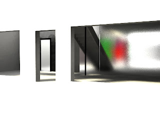
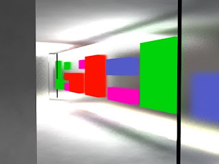
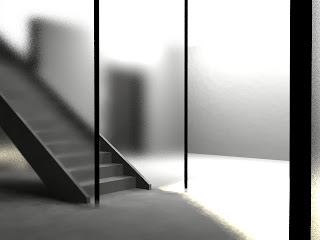
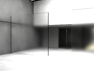
since the site is very long, it allowed me to create some sort of 'journey' to the end of the gallery, instead of going around in circles and so on. what i wanted to achieve was a gallery that was in its own technological world and that technology has become our world that we live in. the artist's purpose in his artworks supports this as well.
in the middle there is a glazed corridor which features 'tv' like images on the glass panels itself. this reflects Nam June Paik's use of televisions as his medium for his works as he wants to reflect and challenge the notion of technology's role upon traditional living.
the gallery uses a combination of natural light from the glass glazing and artificial light from the 'tvs' and other technological elements. this shows the interelationship between natural energy and man made energy.
the floor above contains the office for the owner and directly linked to the apartment itself. the apartment is seperated from the gallery. the apartment recieves lighting from the facade glazing as well as artificial lighting.
project 3 - the site

the site that i have chosen is site 1. the main reason for this is that it is reasonably away from the main intersection and behind the site lies a park. i wanted to link this to my other projects, and my other projects had something to do with the natural environment and the world surrounding. i wanted to create a transition and link between the busy city newtown to the park behind. hence, i saw that site 1 was best fit for my approach to my idea and gallery.
Sunday, May 10, 2009
design ideas & link to the model
there are three windows in the painting: the actual window, the map, and the man (as he is giving insight to the girl and telling her of his edited version of the world)
the painting shows a private conversation and represents how us as the viewer is not invited. hence the model is only one room which creates a place for a private conversation.
the idea of two worlds meeting together of the two contrasting characters:
imprisoned + distorted view of the world (girl)
experienced, pioneering and clear views of the world (father)
the man provides an 'edited' view of the world. you can learn of the world, but never truly feel it until you experience it yourself.
different people have different interpretations of the world, however the world continues to stay consistent and the same.
the kitchen bench represents the household chores of the girl and creates the internal environment which symbolizes her life as her father travelled.
the kitchen area becomes a meeting place once the father arrives, the use of the movable window initiates the meeting area.
the movable window also suggests that the father controls what the girl views as the world and through his 'edited' version is all the girl can know.
the windows are frosted to symbolise a blurred view of the world and not being able to understand it completely and clearly. she is trapped in her own imprisoned world.
the purpose of not having any any doors is to show that the girl i imprisoned in her own world.
the site materials create a contrast to the structure to show the topography is also a key factor in the design. linking back to bawa's 'house for dr bartholomeuz' the environment is the key feature in the design.
the use of simple geometry in this structure also links to bawa's design as i also wanted the topography to be a main feature in the design as well.
the paths on the site represent how in the world there are many opportunities in anything and how through these opportunities, come experience. it also shows a sense of freedom as there are many paths leading to anywhere and providing a sense of choice.
painting & narrative

Jan Vermeer. Soldier and a Laughing Girl. c.1658.
narrative: the key to knowledge is experiencing the world
father leaves his family to explore the world and go to war, while the girl is left at home to take care of her ill mother. the girl couldnt leave the home and is pretty much imprisoned. the father returns and shares his past experiences to the girl in a private conversation.
Monday, April 6, 2009
model pictures (project one)
parti & poche

program
i highlighted how i w the courtyards were the main forms of 'activity' for the residents/visitors, and the fact that the site is very open.

enclosure
i wanted to show how the buildings were the 'enclosed' areas as compared to the courtyards.
Sunday, April 5, 2009
our villa
we were assigned to do "the house for dr barthomomeusz" designed by geoffry bawa
the villa has a great focus on the environment surrounding it. bawa creates spaces throughout the villa to create an illusion that the garden is separate to the structure even though it is bounded by the thick exterior walls. the placement of the pool within the middle of the villa and the perservation of trees also shows proof of the sense bawa aimed for the environment to be the focus of his architecture. the use of simple geometries for the building also shows proof for this. all in all, i believe the environment was the focal point of bawa's design of his piece.
the villa has a great focus on the environment surrounding it. bawa creates spaces throughout the villa to create an illusion that the garden is separate to the structure even though it is bounded by the thick exterior walls. the placement of the pool within the middle of the villa and the perservation of trees also shows proof of the sense bawa aimed for the environment to be the focus of his architecture. the use of simple geometries for the building also shows proof for this. all in all, i believe the environment was the focal point of bawa's design of his piece.
Subscribe to:
Comments (Atom)


